


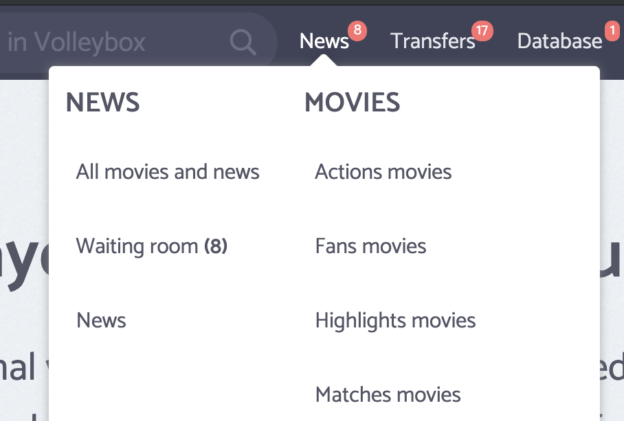
For UX it would be better if notification number badges have the same style.
The bold font is not enough for the quick identification visually which of the sub item has new notifications.
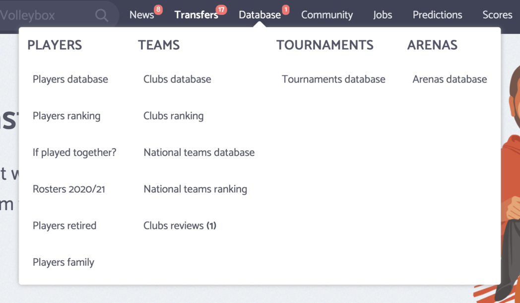
For UX it would be better if notification number badges have the same style.
The bold font is not enough for the quick identification visually which of the sub item has new notifications.
 Who is the best volleyball player ever?Show players ranking
Good point, I was thinking about it.
It will be implemented soon.
Fixed, thanks for the suggestion.